Improving Adherence and Usability in a Gamified Speech Therapy App
Context
Speech and cognitive therapy depends on consistent daily practice. But for patients recovering from strokes or managing neurological conditions, doing that practice at home without a clinician in the room is where most therapy programs fall apart. Adherence drops, progress stalls, and clinicians lose visibility into how their patients are actually doing between sessions.
I came to this project through ELVTR’s Health and Wellness Product Design course I was taking to deepen my consumer health expertise. A brain health coach enrolled in the same course had been brought on to consult for an early-stage startup whose founder, a stroke survivor himself, was building a tool he wished had existed during his own recovery. The coach was looking for a UX researcher with a neuroscience background to collaborate with, and I was really excited about this opportunity, especially since I have a degree in Cognitive and Behavioral Neuroscience.
The team also included Alternova, a UX design firm based in Colombia, who handled visual and interaction design across the product. My role spanned generative research, evaluative research, and design reviews at each iteration, working across both the patient-facing app and the clinician portal.
The platform combined gamified, AI-guided therapy exercises for patients with a clinician portal for speech-language pathologists (SLPs) to assign exercises, track progress, and adjust care. Central to the patient experience was Izzy, an AI avatar assistant designed to guide users through onboarding and therapy with real-time encouragement and feedback. The platform also used speech-to-text conversion to evaluate spoken responses and deliver immediate accuracy feedback. The product vision was strong. The execution needed work.
My Role: UX Researcher and Consultant (KC UX LLC)
Timeline: 2024 – 2025
Team: 1 UX Researcher, 1 UX Designer, 1 Software Engineer, 1 Product Manager
Users: Patients with mild to moderate speech and cognitive impairments, Speech-Language Pathologists (SLPs)
The Human Problem
Patients needed a therapy experience they could actually do, and want to do, on their own. Clinicians needed visibility and control without adding to their administrative burden. The existing app wasn't serving either group well.
The patient-facing app was functional but clunky, cognitively overwhelming, and insufficiently motivating for users who fatigue quickly. The clinician portal lacked the structure SLPs needed to efficiently assign exercises and monitor patient progress. Without research grounding the design, the product risked building engagement mechanics that felt fun to designers but didn't translate to real therapeutic behavior change.
Approach
Phase 1: Generative Research — Understanding Both Sides of the Platform
Before making any recommendations, I needed to understand how both patients and clinicians actually experienced the product. Research this early had to answer two questions simultaneously: where is the current design failing, and what does "good" actually look like for each user group?
Heuristic and accessibility review: I conducted expert reviews of both interfaces against usability and accessibility principles, identifying systemic issues that short sessions might not surface, including contrast ratios, tap target sizes, and motion sensitivity. My recommendations were implemented, and we put the next iteration in front of users.
Moderated usability sessions with patients: Due to difficulties with recruitment, the brain health coach had his patients test out the app in his practice, so I trained him to moderate usability sessions. We couldn’t observe or record the sessions due to HIPAA, but the coach had the patients talk aloud. The patients were older adults with mild to moderate speech and cognitive impairments, and they were observed navigating the existing app. Key focus areas were navigation clarity, cognitive load per screen, feedback timing, and exercise flow.
Clinician validation: I partnered with our team’s SLP to evaluate whether the app's exercises had genuine therapeutic value, and what the clinician portal needed to support their workflow efficiently.
Key generative findings:
Patients benefitted from fewer decisions per screen, explicit next steps, and consistent control placement. The existing navigation buried key actions and overwhelmed users with simultaneous choices.
Timing and tone of feedback mattered: immediate, plain-language confirmation improved confidence and task completion.
The AI speech-to-text feedback was a source of friction. When the system misrecognized a spoken response, users had no clear way to understand why or what to do next, creating confusion and discouragement in a population already prone to frustration with failure.
First impressions of the games and Izzy were mixed. Some users found them approachable and motivating. Others found them too childish for the seriousness of their recovery context.
SLPs needed a lightweight way to assign exercises, review progress snapshots, and flag patients who needed attention, without navigating multiple screens to find basic information.
"I get lost when too many things pop up at once. Just show me one step at a time." (Patient participant, age 72)
"I need to quickly see whether my patient is improving, not click through multiple screens." (SLP participant)
Phase 2: Information Architecture Redesign
The generative research made clear that the navigation structure itself was the primary source of friction, not just individual UI elements. Elements were misplaced, inconsistently named, and organized around the product team's internal logic rather than how patients and clinicians actually think about their tasks.
I led an information architecture redesign of the patient-facing app, consolidating redundant sections, renaming elements to match user language, and restructuring the exercise flow to reduce decision points per screen. Accessible tutorials were added at key entry points. Instructions appeared for longer periods of time and were able to be accessed once disappeared. Button widths and color contrast were updated to meet accessibility standards for older adults.
On the clinician side, the portal was restructured to surface the most critical information first: patient assignment status, recent activity, and flagged attention items, all accessible from a single view.
Phase 3: AI Avatar and Feedback Research
Two AI-driven features were central to the patient experience and both needed dedicated research attention: Izzy, the in-app SLP avatar assistant, and the speech-to-text feedback system.
Avatar perception research: The tone and visual design of Izzy created a tension that the generative research surfaced immediately. For users recovering from stroke or managing neurological conditions, the stakes of daily therapy are real and personal. An avatar that read as too playful or childlike risked undermining the credibility of the experience. Too serious, and it lost the warmth and encouragement the product needed to sustain engagement.
I conducted structured user sessions to evaluate how patients perceived Izzy across a range of design directions, gathering both quantitative ratings and open-ended responses on tone, trustworthiness, approachability, and fit with the therapeutic context. Findings directly informed the final avatar design, calibrating tone and visual style to feel encouraging without being dismissive of the seriousness of recovery.
Speech-to-text accuracy and feedback clarity: When the AI misrecognized a spoken response, users had no recovery path. They didn't know whether they had made an error, whether the system had failed, or what to try next. For users with speech impairments, repeated misrecognition without clear feedback was demoralizing.
I documented failure patterns across sessions and worked with the product team to define clearer error states, plain-language feedback messages, and retry affordances that gave users a sense of control rather than confusion.
Phase 4: Brand Research and Visual Direction
First impressions matter especially in wellness apps, where tone and emotional resonance directly affect whether a user trusts the product enough to engage with it consistently. The product team needed a visual identity that felt warm and motivating without tipping into clinical coldness or juvenile playfulness, a difficult balance for a platform serving both patients in recovery and medical professionals.
I researched color psychology in health and wellness contexts and developed moodboards to define a visual direction before the design team committed to a palette.
Key findings that shaped the direction:
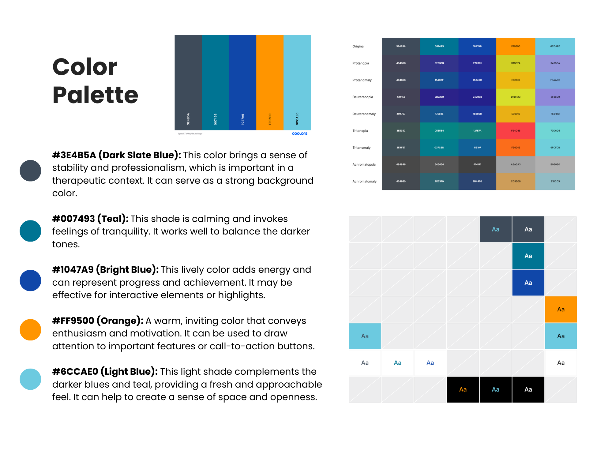
I tested the moodboards with users, gathering quantitative ratings on emotional resonance and open-ended feedback on perceived fit with the app's purpose. The final palette was validated against WCAG accessibility standards to ensure sufficient contrast ratios for older adults and users with visual sensitivities.
Phase 5: Competitive and Gamification Analysis
Once the structural, visual, and accessibility foundations were addressed, I turned to the motivation problem. The existing gamification felt flat and wasn't driving the consistent daily practice the product needed.
I reviewed 12 leading gaming and brain-training apps, including BrainHQ, Lumosity, Duolingo, and Candy Crush, documenting engagement mechanics around progress tracking, rewards, streaks, and feedback loops. I evaluated which mechanics were transferable to a therapeutic context with users who may fatigue quickly or feel discouraged by failure.
Key gamification findings:
Micro-progress (session checkmarks, daily mini-goals) outperformed heavy meta-systems for this user group.
Streaks are useful only if forgiving. Grace periods and gentle resets prevent discouragement.
Positive reinforcement through simple progress badges and encouraging copy supported motivation without pressure.
These findings directly informed the gamification mechanics built into the redesigned exercise flow and contributed to MVP feature specifications.
Throughout each phase, I facilitated cross-functional workshops with clinicians, designers, and the product team to translate findings into prioritized decisions. Each research cycle closed with a stakeholder readout and a clear set of actionable recommendations tied to measurable UX success metrics.
Impact
30% faster task completion and 25% increase in first-time success for users with cognitive impairments following navigation architecture and UI changes.
Contributed to successful beta launch within 12 months. Research directly informed MVP feature prioritization and scope decisions.
Clinician portal restructured around SLP workflow. Assignment, progress visibility, and patient flagging accessible from a single view.
Evidence-based gamification mechanics adopted into product, grounding engagement design in what actually drives therapeutic behavior change for this user group.
Accessibility improvements implemented across color contrast, tap targets, button widths, and motion, meeting standards for older adults with cognitive and physical impairments.
AI avatar design shaped by user research. Iterative testing calibrated Izzy's tone and visual style to feel encouraging and age-appropriate, without undermining the seriousness of the recovery context.
Speech-to-text failure states redesigned based on documented error patterns, giving users clear feedback and a recovery path when the AI misrecognized spoken responses.
Brand direction validated through user testing, resulting in a cohesive visual identity that tested as trustworthy, motivating, and accessible across both user groups.
Learnings I’ll take with me
What was hard: Designing for two user groups with fundamentally different needs on the same platform. What reduces cognitive load for a patient recovering from a stroke (fewer choices, slower pacing, forgiving mechanics) can feel reductive to a clinician who needs information density and workflow efficiency. Holding both mental models simultaneously, and designing for the tension between them, was the core research challenge.
What I learned: Gamification transfers well into therapeutic contexts when it's simplified, forgiving, and paired with clear and timely feedback. But it only works if the underlying navigation and structure isn't already creating friction. Fixing the foundation first was the right call. Engagement mechanics built on a confusing IA would have failed regardless of how well-designed they were.
Next: Prototype key mechanics (session goals, micro-rewards, progress snapshots) and re-test with users and clinicians before full build.